Last week I started putting together my front cover for my magazine, I started off by putting in all my sell lines because I hadn't yet done my photoshoot. Putting in my sell lines I didn't have a colour scheme fully decided on and I think that slowed me down a bit. Also because I hadn't done my photoshoot earlier I had to re-arrange all my sell lines to work with the picture. However my photoshoot went very well and I got some good shots for my magazine.
I learnt from my photoshoot that you have to guide your models to do what you want in order for them to do what it is you want to show. Whilst I had my photo shoot plan in place I still felt unorganised as to what it was I wanted my models to do. I chose to use an image of Becky as my front cover because in the picture she looks self concious whilst drinking her alcoholic beverage. My assessor didn't really like the stroke effects I had on some of my sell lines, but liked the colour scheme.
I'm happy with the way my front cover works, I think the colour scheme works together nicely. I also like the fonts that I have chosen to use as they are quite edgy and different. In order to reach the dead line I'm going to have to organise my time properly to be able to put everything together.
I think not having my photoshoot done until the Friday has slowed me down causing a problem but putting in extra time outside of lesson means that I should be able to catch up with my work. However it was easy doing the photoshoot and it went well.
Friday, 22 March 2013
Monday, 7 January 2013
Disability article
This is the double page spread I created on Indesign.
The rule of three's is where 3 images are grouped together, this helps the spread to looked balanced.
A skill I have developed whilst using Indesign is giving an image a 3D effect by making the pictures look like polaroids. This catches the readers attention and draws them in. The use of drop shadow and overlapping makes the images stand out on the page and again gives the images a 3D effect.
In order to create the background firstly you must select a subtle image, like mine and copy the image or save it to your files. You then place the image into Indesign and select the rectangle tool and highlight over the image to size. You then right click on the box you've created and send it to the back. Ensuring that the image is viewed in high quality display so that the image isn't pixelated. You then fill in the box you've made and fill it in so that it is white (to create the polaroid effect), you then use the black arrow to place your image over the white box and then use ctrl G to group the images together and move around as one image. The rotation tool allowed me to move the images very slightly so that the images again have the polaroid look.
In order to make my title, I used photoshop. the page was set up to be 300mm wide x 100mm in height. The page needs to be transparent so that only the writing shows up and not the background of the title.
The rule of three's is where 3 images are grouped together, this helps the spread to looked balanced.
A skill I have developed whilst using Indesign is giving an image a 3D effect by making the pictures look like polaroids. This catches the readers attention and draws them in. The use of drop shadow and overlapping makes the images stand out on the page and again gives the images a 3D effect.
In order to create the background firstly you must select a subtle image, like mine and copy the image or save it to your files. You then place the image into Indesign and select the rectangle tool and highlight over the image to size. You then right click on the box you've created and send it to the back. Ensuring that the image is viewed in high quality display so that the image isn't pixelated. You then fill in the box you've made and fill it in so that it is white (to create the polaroid effect), you then use the black arrow to place your image over the white box and then use ctrl G to group the images together and move around as one image. The rotation tool allowed me to move the images very slightly so that the images again have the polaroid look.
In order to make my title, I used photoshop. the page was set up to be 300mm wide x 100mm in height. The page needs to be transparent so that only the writing shows up and not the background of the title.
Thursday, 15 November 2012
Levels and Curves Tutorial
Today in photoshop we used levels and curves to give an image a more 'retro' look. Cross processing was a technique used in the 1980's to develop film. The first image shows the unedited version of the subject. And the second image below shows my cross processed image. The top corner of the scale for the levels brings out the colours (Red, green and blue) within in the image whilst the bottom corner of the scale takes the colours out.
In order to create the image, I first went to photoshop and selected the image that I wanted to use. Next I created a new adjustment layer. I then selected curves and changed the red curve which can bring out the red more or take it out. We had to create an S shape with the red and the same with the blue level. With the green we didn't have to create an S shape, but just had to play around a bit to make the image look more 'retro'. After this I added another adjustment layer and added a solid colour. I chose to use a pinky colour and then changed the opacity down so that the pink faded out but was still visible in the picture.
This lesson has taught me how to play around with levels to give the image a different look, I now know how to add a solid colour, fade it out and how to add a new adjustment layer. I can now add colours or take colours away by using the levels.
Wednesday, 14 November 2012
Heal Brush tutorial

This is an image of Zoe before we used the heal brush tool to cure her skin issues on photoshop. In order to do this we first selected the image of Zoe before we photoshopped her, we simply seletced the heal brush tool and each time we went to heal a section of her face, we would place the brush tool next to the spot and press alt on the keyboard. This ensured we had the correct skin tone so that it didn't look unnatural. The image below shows how well the heal brush tool worked.
This lesson taught me how to use the heal brush tool on photoshop and to get a natural looking skin tone in order to keep the photo looking natural and unedited.
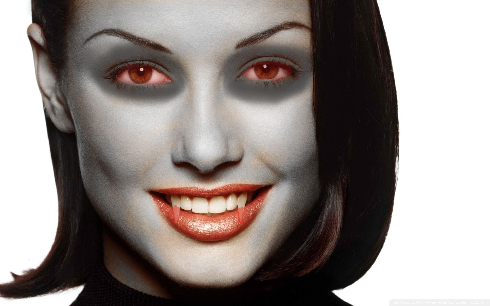
Photoshop edits - Vampire
In the lesson in order to make the subject look like a vampire, I first used the sponge tool to make her skin grey, the setting I had it on was desaturate in order to make her look more 'dead'. Next I used the burn tool on the 'highlights' setting in order to darken the sujects eyes. Next in order to make the 'fangs' I used the magnetic lassoo tool to select the tooth and then went to edit, transform and warp. This created a sort of mesh around the tooth to which I could then extend the tooth to an appropriate size. I repeated this step with the other tooth. I then pressed enter and ctrl D, this de-selects the tooth. And finally to make the eyes red and add blood to the fangs I had to create a new layer and use the brush tool. I then had to colour the eyes and teeth in before changing the setting from just blood red to more opaque so it looked less edited.
This lesson has taught me how to desaturate the image in order to make the subject look more 'dead'. The lesson also taught me how to change the opacity of the paint brush tool.
Photoshop edits.
In todays Media lesson we had to edit images on photoshop. We had to use vingetting on an image, desaturartion, brightness/contrast and autocolour to change the images.Today's lesson helped me how to use autocolour/contrast in photoshop as well as how use vingetting in an image.
This image is the brightness/contrast image. In order to autocolour/contrast this I first had to desaturate the image, by going into image and then to adjustments and then to desaturate. I then went and changed the brightness/contrast of the image. The reason for using autocolour and auto contrast makes the image brighter. It makes the blacks in the image blacker and the whites whiter.
This image is the vingetting image I created. Vingetting is used to create a focus on the target in the image. It darkens the corners within the image. To do this I first selected the eliptical markee tool and set it to between 60 to 90 pixels. Then selected a gradiated line, select the image and then inverse. Then go to image adjustment and then used ctrl D, which then de-selects the image.
And this is the autocolour/autocontrast image. To do this I went into image on photoshop and then to auto tone which then gave the options to auto contrast and auto colour. I then went to filter and to unsharpen mask to a 2.0 pixel radius. In magazines, the eyes need to draw the reader in and therefore need to be as sharp as possible.
Below is the original image.
Monday, 5 November 2012
Nature's Heroes 26/10/2012
Today we created a CD cover for Nature's Heroes single 'Old School'. We looked at how to use tools.
To create the pink fade background I used the gradient tool, and for the various 'brushes' such as the apple, and the scissors we went on a site called brusheeze to download a brush for our CD cover. After downloading the brush, you select it in the brush tool menu on photoshop and then select the various little brushes to use. I then re-sized and changed the colour of the brushes to give it a child like effect of being back at scool. The use of master diameter also changes the size. I added a bar code to make the CD cover realistic.
Subscribe to:
Posts (Atom)