Wednesday 1 May 2013

Unit 3 finalised product.

This is the finalised front cover for my unit 3 project.
Above is my finished article and double page spread.

Thursday 25 April 2013

Blog write up 11th March

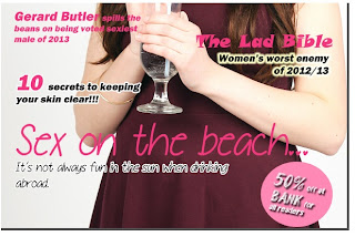
Last week I managed to start setting up my front cover for my magazine. Whilst I haven't yet done my photoshoot I have managed to put in my mast head and the sell lines for my front cover. The skills that I devleoped in photoshop was being able to insert my own sell lines and mast head without needing to ask for help, I also managed to add effects to the sell lines and such as well as add effects such as stroke to make my mast head and sell lines stand out on the front cover. The stroke effect on my sell lines and mast head allows these to not be dominated by the picture.

In the production period of my magazine I don't think I was as well organised as I could of been. I left the photoshoot until the last minute and this meant that I couldn't work on the pictures up until I had done the photoshoot. I also didn't really know what poses and such I wanted my models to do so I should have decided what it was I wanted my models to portray. However the outcome of my photos were very good and I was pleased with them.

For my front cover I chose to use an image of Becky (my model) sipping on a drink looking directly at the camera. I chose this image because Becky's eye contact draws the audience in and shows her looking vunerable which works well with the type of article that it is.

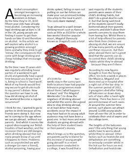
I found that writing up my article was difficult, I had to find all the necessary statistics for my article and then fit them into my article. It took a while to write up but once I had gotten into it it became a lot easier to type up. My article read quite well, although it was a large article it all fit in well. When it came to re-writing the article I focused on making sure that the article read well and didn't focus on one story. When re-writing the article I focused on the spelling and grammar to ensure it read well and didn't have any spelling mistakes.


The elements of my product that people liked what the photography and the sell lines, they thought that they went together well and that the colours made the sell lines stand out so there was no worry of not being able to read the sell lines. Things that my peers didn't like was the font that I used for the article, they felt that it didn't really make a statement and just looked like a girly article. I think that my project was quite creative considering I've never done this sort of project before, I was very pleased with the outcome of the photographs that I used and the way that the article is set out. The lipstick mark breakout box allowed for a nice breather in the article. I'm also pleased with the layout of the project, however I think that the text to picture ratio is off.

When it came to putting the whole project together, such as putting in the text and fitting the images in and such took longer than I expected and left me very little time to put it all together and move it around. Placing all the text in took the longest because it was such a big article I had to fit it into the right amount of columns without cutting any of the article out.
However once I had overcome these issues I found it a lot easier to place it all together and then didn't take as long to complete.
 I think that I should have done my photoshoot before I started putting in my sell lines, I should have organised my time better in order to do everything in a sensible order. I think more time spent on the sell lines and editing the photos may have benefitted me more than stressing over the article. My project was completed in time for the deadline but only just in time.
 
 Luckily for me I didn't have to use any of my contingency plan, my models all turned up in the correct costume and were on time. I had a tripod at the shoot and the images weren't blurry. I made sure that all my work was saved every 10 minutes or so just in case my computer crashed and I didn't use a memory stick to avoid the problem of my memory stick breaking and thus losing all my work.


Continuous shoot mode 25/4/13

Continuous shoot mode photo shoot


For my continuous shoot mode I used Becky as my model. I did try to capture the images with the use of bubble gum however the bubble gum didn't work out to plan. So I instead chose to use images of Becky moving into a running jump. I'm quite pleased with how the images came out however because of Becky's quick movement they are slightly blurry where she is moving quickly.

Continuous shoot mode is used to get movement in a set of images. for example you can capture images of a dancer moving around (whilst dancing)
 
In order to capture these images I first of all went to a well lit area, put the camera on continious shoot mode, set the camera to the portrait setting and they took a few practise shots. Once I understood how to work the camera I made sure the camera was in focus and used the zoom to zoom in and out. Capturing the above images I was zoomed out in order to get most of Becky into the images. The bubblegum images came out mostly blurry and to overcome this issue I messed around with the focus lens to fix the bluriness.

Wednesday 24 April 2013

1st Person Creative Writing

We've all been there, you and I. It's been a long week, you've been working hard at work (or not) and it's now the weekend. YES! We both know what time it is. It's time to get dolled up and head out on the town. Be sensible I tell myself, not too much now! The night starts with drinking games, chanting 'down it' over and over again to my friends as we apply friendly peer pressure on the reluctant drinker. And then I wake up. I look around, take in the room I don't remember returning too. I lay there dazed and confused, what happened last night? I check my phone and there it is the facebook notifications, the 17 missed calls off my friends and the texts. I look through the notifications and cry out as I scroll through the pictures from last night. Oh what a state I was in. I hear a groan, startled I turn over and there, in MY bed is my best friend Mark. We both look at each other in surprise and then look under the covers. Both naked! Shit! We look at each other again...'did we errr?' I begin. 'I don't know' Mark cuts in. Oh God. We decided for the sake of our friendship that it didn't happen. And to this day we don't discuss it.

Sounds like a funny drunken story, right? And it was! Let's be honest, we've all ended up in a funny situation where alcohol has been involved because let's be serious, no funny story starts with a salad!

However whilst it's all fun and games when it comes to alcohol, it isn't necessarily always a pleasant ending for everyone. Did you know that where alcohol is involved it causes 15% of road traffic accidents, 26% of drownings and 36% of death involving fire. These statistics are considerably high, and I'm sure that whilst on a night out, getting harmed won't be on the agenda. But at the end of the day, were alcohol is concerned, you lack control of these situations. I had a friend who had one night had far too much to drink and went missing, she was later found in a little stream after she had stumbled and fell down a hill and sadly passed away from drowning.

Friday 22 March 2013

Blog write up 22/3/13

Last week I started putting together my front cover for my magazine, I started off by putting in all my sell lines because I hadn't yet done my photoshoot. Putting in my sell lines I didn't have a colour scheme fully decided on and I think that slowed me down a bit. Also because I hadn't done my photoshoot earlier I had to re-arrange all my sell lines to work with the picture. However my photoshoot went very well and I got some good shots for my magazine.

I learnt from my photoshoot that you have to guide your models to do what you want in order for them to do what it is you want to show. Whilst I had my photo shoot plan in place I still felt unorganised as to what it was I wanted my models to do. I chose to use an image of Becky as my front cover because in the picture she looks self concious whilst drinking her alcoholic beverage. My assessor didn't really like the stroke effects I had on some of my sell lines, but liked the colour scheme.

I'm happy with the way my front cover works, I think the colour scheme works together nicely. I also like the fonts that I have chosen to use as they are quite edgy and different. In order to reach the dead line I'm going to have to organise my time properly to be able to put everything together.

I think not having my photoshoot done until the Friday has slowed me down causing a problem but putting in extra time outside of lesson means that I should be able to catch up with my work. However it was easy doing the photoshoot and it went well.


Monday 7 January 2013

Disability article

This is the double page spread I created on Indesign.
The rule of three's is where 3 images are grouped together, this helps the spread to looked balanced.
A skill I have developed whilst using Indesign is giving an image a 3D effect by making the pictures look like polaroids. This catches the readers attention and draws them in. The use of drop shadow and overlapping makes the images stand out on the page and again gives the images a 3D effect.
In order to create the background firstly you must select a subtle image, like mine and copy the image or save it to your files. You then place the image into Indesign and select the rectangle tool and highlight over the image to size. You then right click on the box you've created and send it to the back. Ensuring that the image is viewed in high quality display so that the image isn't pixelated. You then fill in the box you've made and fill it in so that it is white (to create the polaroid effect), you then use the black arrow to place your image over the white box and then use ctrl G to group the images together and move around as one image. The rotation tool allowed me to move the images very slightly so that the images again have the polaroid look.
In order to make my title, I used photoshop. the page was set up to be 300mm wide x 100mm in height. The page needs to be transparent so that only the writing shows up and not the background of the title.

Thursday 15 November 2012

Levels and Curves Tutorial

 
Today in photoshop we used levels and curves to give an image a more 'retro' look. Cross processing was a technique used in the 1980's to develop film. The first image shows the unedited version of the subject. And the second image below shows my cross processed image. The top corner of the scale for the levels brings out the colours (Red, green and blue) within in the image whilst the bottom corner of the scale takes the colours out.
 
In order to create the image, I first went to photoshop and selected the image that I wanted to use. Next I created a new adjustment layer. I then selected curves and changed the red curve which can bring out the red more or take it out. We had to create an S shape with the red and the same with the blue level. With the green we didn't have to create an S shape, but just had to play around a bit to make the image look more 'retro'. After this I added another adjustment layer and added a solid colour. I chose to use a pinky colour and then changed the opacity down so that the pink faded out but was still visible in the picture. 

This lesson has taught me how to play around with levels to give the image a different look, I now know how to add a solid colour, fade it out and how to add a new adjustment layer. I can now add colours or take colours away by using the levels.