Thursday 15 November 2012

Levels and Curves Tutorial

 
Today in photoshop we used levels and curves to give an image a more 'retro' look. Cross processing was a technique used in the 1980's to develop film. The first image shows the unedited version of the subject. And the second image below shows my cross processed image. The top corner of the scale for the levels brings out the colours (Red, green and blue) within in the image whilst the bottom corner of the scale takes the colours out.
 
In order to create the image, I first went to photoshop and selected the image that I wanted to use. Next I created a new adjustment layer. I then selected curves and changed the red curve which can bring out the red more or take it out. We had to create an S shape with the red and the same with the blue level. With the green we didn't have to create an S shape, but just had to play around a bit to make the image look more 'retro'. After this I added another adjustment layer and added a solid colour. I chose to use a pinky colour and then changed the opacity down so that the pink faded out but was still visible in the picture. 

This lesson has taught me how to play around with levels to give the image a different look, I now know how to add a solid colour, fade it out and how to add a new adjustment layer. I can now add colours or take colours away by using the levels.


Wednesday 14 November 2012

Heal Brush tutorial


This is an image of Zoe before we used the heal brush tool to cure her skin issues on photoshop. In order to do this we first selected the image of Zoe before we photoshopped her, we simply seletced the heal brush tool and each time we went to heal a section of her face, we would place the brush tool next to the spot and press alt on the keyboard. This ensured we had the correct skin tone so that it didn't look unnatural. The image below shows how well the heal brush tool worked.

This lesson taught me how to use the heal brush tool on photoshop and to get a natural looking skin tone in order to keep the photo looking natural and unedited.

Photoshop edits - Vampire


In the lesson in order to make the subject look like a vampire, I first used the sponge tool to make her skin grey, the setting I had it on was desaturate in order to make her look more 'dead'. Next I used the burn tool on the 'highlights' setting in order to darken the sujects eyes. Next in order to make the 'fangs' I used the magnetic lassoo tool to select the tooth and then went to edit, transform and warp. This created a sort of mesh around the tooth to which I could then extend the tooth to an appropriate size. I repeated this step with the other tooth. I then pressed enter and ctrl D, this de-selects the tooth. And finally to make the eyes red and add blood to the fangs I had to create a new layer and use the brush tool. I then had to colour the eyes and teeth in before changing the setting from just blood red to more opaque so it looked less edited.
This lesson has taught me how to desaturate the image in order to make the subject look more 'dead'. The lesson also taught me how to change the opacity of the paint brush tool.

Photoshop edits.

In todays Media lesson we had to edit images on photoshop. We had to use vingetting on an image, desaturartion, brightness/contrast and autocolour to change the images.Today's lesson helped me how to use autocolour/contrast in photoshop as well as how use vingetting in an image.
This image is the brightness/contrast image. In order to autocolour/contrast this I first had to desaturate the image, by going into image and then to adjustments and then to desaturate. I then went and changed the brightness/contrast of the image. The reason for using autocolour and auto contrast makes the image brighter. It makes the blacks in the image blacker and the whites whiter.


This image is the vingetting image I created. Vingetting is used to create a focus on the target in the image. It darkens the corners within the image. To do this I first selected the eliptical markee tool and set it to between 60 to 90 pixels. Then selected a gradiated line, select the image and then inverse. Then go to image adjustment and then used ctrl D, which then de-selects the image.

And this is the autocolour/autocontrast image. To do this I went into image on photoshop and then to auto tone which then gave the options to auto contrast and auto colour. I then went to filter and to unsharpen mask to a 2.0 pixel radius. In magazines, the eyes need to draw the reader in and therefore need to be as sharp as possible.

Below is the original image.


Monday 5 November 2012

Nature's Heroes 26/10/2012


Today we created a CD cover for Nature's Heroes single 'Old School'. We looked at how to use tools.
 To create the pink fade background I used the gradient tool, and for the various 'brushes' such as the apple, and the scissors we went on a site called brusheeze to download a brush for our CD cover. After downloading the brush, you select it in the brush tool menu on photoshop and then select the various little brushes to use. I then re-sized and changed the colour of the brushes to give it a child like effect of being back at scool. The use of master diameter also changes the size. I added a bar code to make the CD cover realistic.

Friday 19 October 2012

12/10/12 Shutter Speed


Today we used shutter speed in order to capture moving objects and avoid motion blur.
In the image to the left we can see that the moving object (Jack) isn't touching the ground as he has jumped, but the image is not blurry. For this image the shutter speed was set to about 1/250th of a second which is used roughly to capture people as they aren't that fast moving.

In this image we can see that the object is walking but we have avoided motion blur by using the shutter speed. Again I used 1/250th of a second to capture this image.

To capture the object moving in this image I used 1/500th of a second. Because Jack was moving quicker by running rather than walking to avoid motion blur we had to increase the shutter speed to capture his image.

In today's lesson about shutter speed I learnt that 1/60th of a second is the slowest you can go without motion blur. To avoid shakey or blurry images a use of a tripod should keep the camera still and therefore capture a clean image of the object you are photographing. A person walking works out at about 3mph and that means that using 1/250th of a second will capture the image, whilst running works out at about 10mph and therefore using 1/500th of a second will catch the slightly faster moving object without motion blur.
The shutter is just used to capture light.


In order to capture the light in this image, Becky had the camera set to TV with 1/30th of a second which lasts for 30 seconds. Below are some other images of Becky that I took using shutter speed set at 1/30th of a second. As well as shutter speed, we used the flash to take these images as well.


In order to improve on these images I think more practise using different settings on the shutter speed could improve my images giving the subject more time to create something with the light.

Monday 8 October 2012

Shown above is my front cover design for my magazine 'Unconventional'.
Below are some other images that I took of my subject for my front cover. All the images are raw and unedited.
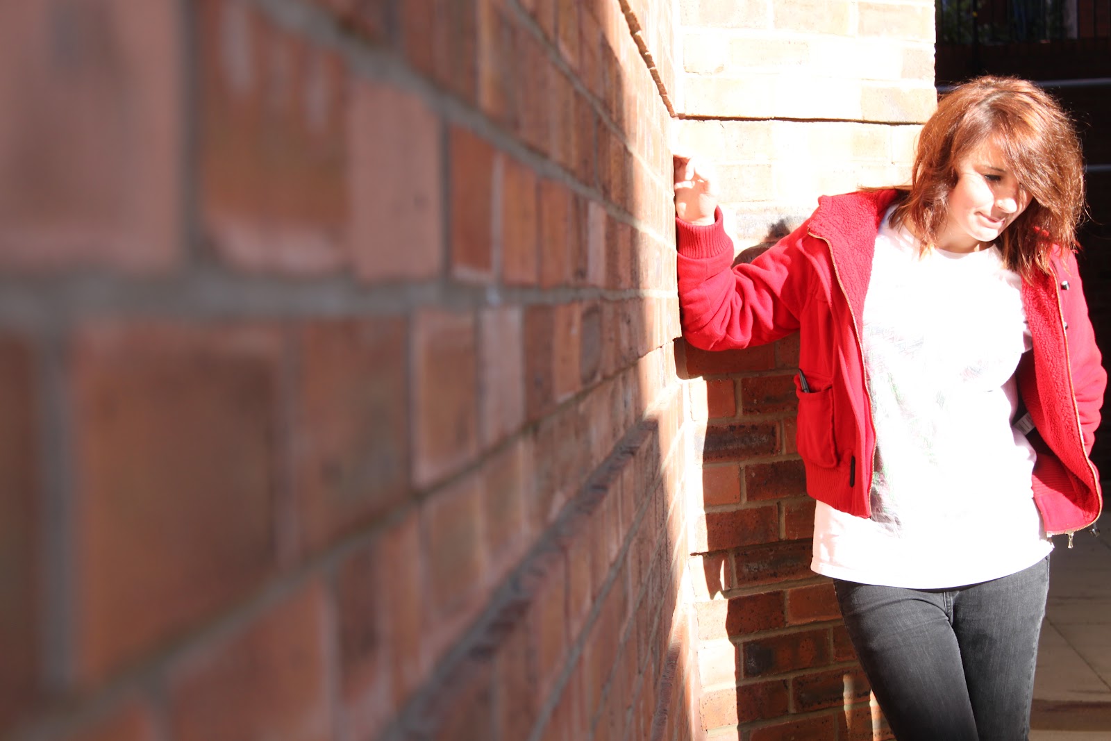
The image above I should have used the 'T-stance' to get a better head and shoulder shot rather than a body shot of the subject.

With the first image I like how the subject is stood at an angle rather than straight on looking at the camera. However I think I should have used the focus ring so that the image is less blurry.
The second imafe I like as image as the background is sort of naturally blurred out so that Kay is the main focus within the image. Again I could have used the T-stance so that I got a closer image on Kay's face.

Induction Evaluation.

In order to create my front cover I used manual focus and took the photos in portrait mode as we were photographing people rather than a landscape. The zoom ring on the camera means you can zoom in and out on the focus of your image depending on what detail you want to capture in the image. With the photos that I took I used the zoom ring in order to capture a closer image on Kay's face for my front cover and I used the focus ring to make sure that the image was clear. The majority of my images used the rule of thirds with the eyeline in the correct place, however some of my shots meant that the eyeline was not in the correct place, this is something I could improve on and better myself at sp the images I take will oblige with the rule of thirds. I learnt that different lighting (such as back, side and front) exposes the pictures in different ways. With the background I didn't think about the background but in future as an improvement I should carefully think about the background so that it is relelvant to the magazine, the image and particular topic that may appear within my magazine.
When it came to handling my subject (Kay) I think that I maybe could of handled her better, maybe asked her to pull a particular face or pose to go with the magazines image. I do feel that we did try to communicate with each other as best we could but it was still quite awkward between us as we don't know each other very well. I feel that just relaxing and having a laugh will make the images easier to capture rather than having you subject being stiff and awkward as they may not be used to having their picture taken so intimately and in-your-face. I don't think my lack of people skills effected my images too much as I still took a few good shots. I'd probably take better shots with the improvement of my people skills and feeling comfortable around other people/subjects.

In order to create my front cover we used photoshop. I'd never used photoshop before up until I started doing media as a subject. One of the tools I used was the text tool to put text onto my front cover so that it wasn't a blank image. I also used the grab tool to move my text and images I input to move them around to where I thought they were better suited. I found that trying to make my text stand out against my subject's dark hair difficult up until I used stroke and bevel and emboss to highlight the outside of the etxt to make it stand out. Varying the stroke and bevel and emboss effect meant that the text on my image stood out in different ways. I found adding text was easy  but difficult to control. I experimented a bit and got the hang of controlling the text and adding effects so that the text wasn't plain and boring. I did not drop shadows on my front cover as I didn't think it looked right. In order to have my own font I went on Dafont.com to pick a font that suited my magazine. I downloaded the font, and sent it to 'Fonts' in the 'WINDOWS' file on my computer, I then copied and pasted it into the 'Fonts' folder. I chose to use Two O'Clock as the font because it stood out and I feel it works with the name of my magazine 'Unconventional' means to be different as such and I think the font goes well with that. The colours I used for the name of the magazine were made up of pink as the inner colour and black for the bevel and emboss so that it's the first thing that your eyes get drawn to on the title page. It's different and recognisable. The other texts were not as vibrant as the title but a lot of the sell lines were bevelled and embossed to stand out as well to catch the readers eye. To improve my front cover I'd want to have my image of Tay Jardine faded so that she was in the background as such rather than on  a white backdrop so it takes up less room. I feel that if I knew more about photoshop I could greatly improve my front cover and I feel that's something that I need to improve on as a target for myself. However overall I feel I did quite well with my front cover considering I know very little about photoshop or camera work, the image fits well and isn't stretched or blurry and the text stands out so that it is eye catching. I also think that the pricing and bar code make it look a lot more realistic. The subjects eye line is on the rule of thirds and the head and shoulder shot works great.

Friday 5 October 2012

Paired camera work w/Becca

4/10/2012.
In todays camera work we reinforced the skills using the zoom and focus lenses on the camera. These skills ensure the picture is clear and not too close or too far away.

We used lines to draw a subject in to the main focus of the picture. The shot below shows this as an example. The problem with this image is that it is landscape rather than portrait. But you can see that the lines draw you in to the subject. I'm also not directly in the centre of the image so the first thing you see is the wall and the lines.

Another thing we used was using an object within the shot as a frame. In this image I possibly should have zoomed in slightly so that Becca's eyeline was above the rule of 3rd's. Here her eyeline is below. I could have had Becca stand somewhere towards the edge of the frame so that she wasn't dead set in the middle.
This is a tilt down shot, I learnt that the tilt down shot makes the subject within the shot (in this case Becca) powerless and the person viewing the picture more powerful. Again with this shot, I should have had placed Becca slightly out of the centre. The good thing about this shot however is that the shadow casted on her face makes her look slightly mysterious.
This is a tilt up shot of me taken by Becca. The lighting isn't very good and therefore you can't see all that much detail in my face. Tilt up shots have a tendency of not being very flattering for the nose and therefore the shots have to be carefully taken. I feel I could have been slightly off centre a bit more. Tilt up shots are used to make the person in the shot seem more powerful whilst the reader is slightly powerless.

I think that with more practise with lighting and using the zoom and focus lenses that the pictures I take will be clearer and easier to view.

Thursday 20 September 2012

Initial Skills Assessment

AS Media Production: Technical Skills Audit Print Production

Name:       Jade Barlow                Tutor group:      1.22 Date:20/9/12

Photographic Skills
Which of the following photographic features/equipment have you used on a camera before:

Feature
Yes
No
Comments if yes – where have you completed this skills and to what level
Manual Focus features

N


Shutter Speed

N


Aperture control

N


A tripod

N


External flash

N


Self timer facility

N


Light meter

N


Composition grids

N


Photoshop Skills
Which of the following features of Photoshop have you used before:


Feature
Yes
No
Comments if yes – where have you completed this skills and to what level
Have you ever used Photoshop ever before?

N


Text control

N


Filters

N


Brushes

N


Layers

N


Opacity control

N


Shape creation

N


Brightness and contrast control

N


Dodge/Burn

N


Clone stamp tool

N


Colour curves adjustment

N


Resolution setting control

N


Magnetic lasso, polygon lasso tool

N


Cropping tool

N


Retouch tool

N


In Design Skills
Which of the following features of In Design have you used before:


Feature
Yes
No
Comments if yes – where have you completed this skills and to what level
Have you ever used In design ever before?

N


Margin and column guide creation

N


Inserting text in ID

N


Inserting images in ID

N


Resizing images in ID


N

Text manipulation – resizing, rotation

N


Text manipulation – controlling kerning and leading

N


Text flow creation


N

Text effects – drop shadow


N

Drop cap insert


N


Using transparent imagery in ID

N


Shape creation In design

N


Text wrapping


N

Exporting to PDF from In-design

N