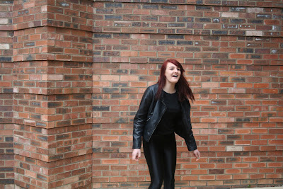
In the production period of my magazine I don't think I was as well organised as I could of been. I left the photoshoot until the last minute and this meant that I couldn't work on the pictures up until I had done the photoshoot. I also didn't really know what poses and such I wanted my models to do so I should have decided what it was I wanted my models to portray. However the outcome of my photos were very good and I was pleased with them.
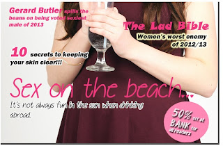
For my front cover I chose to use an image of Becky (my model) sipping on a drink looking directly at the camera. I chose this image because Becky's eye contact draws the audience in and shows her looking vunerable which works well with the type of article that it is.
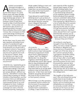
I found that writing up my article was difficult, I had to find all the necessary statistics for my article and then fit them into my article. It took a while to write up but once I had gotten into it it became a lot easier to type up. My article read quite well, although it was a large article it all fit in well. When it came to re-writing the article I focused on making sure that the article read well and didn't focus on one story. When re-writing the article I focused on the spelling and grammar to ensure it read well and didn't have any spelling mistakes.
 The elements of my product that people liked what the photography and the sell lines, they thought that they went together well and that the colours made the sell lines stand out so there was no worry of not being able to read the sell lines. Things that my peers didn't like was the font that I used for the article, they felt that it didn't really make a statement and just looked like a girly article. I think that my project was quite creative considering I've never done this sort of project before, I was very pleased with the outcome of the photographs that I used and the way that the article is set out. The lipstick mark breakout box allowed for a nice breather in the article. I'm also pleased with the layout of the project, however I think that the text to picture ratio is off.
 When it came to putting the whole project together, such as putting in the text and fitting the images in and such took longer than I expected and left me very little time to put it all together and move it around. Placing all the text in took the longest because it was such a big article I had to fit it into the right amount of columns without cutting any of the article out.
 However once I had overcome these issues I found it a lot easier to place it all together and then didn't take as long to complete.
I think that I should have done my photoshoot before I started putting in my sell lines, I should have organised my time better in order to do everything in a sensible order. I think more time spent on the sell lines and editing the photos may have benefitted me more than stressing over the article. My project was completed in time for the deadline but only just in time.
Luckily for me I didn't have to use any of my contingency plan, my models all turned up in the correct costume and were on time. I had a tripod at the shoot and the images weren't blurry. I made sure that all my work was saved every 10 minutes or so just in case my computer crashed and I didn't use a memory stick to avoid the problem of my memory stick breaking and thus losing all my work.


